

BRANDING: CitibaSE IDentity
Jan 2012
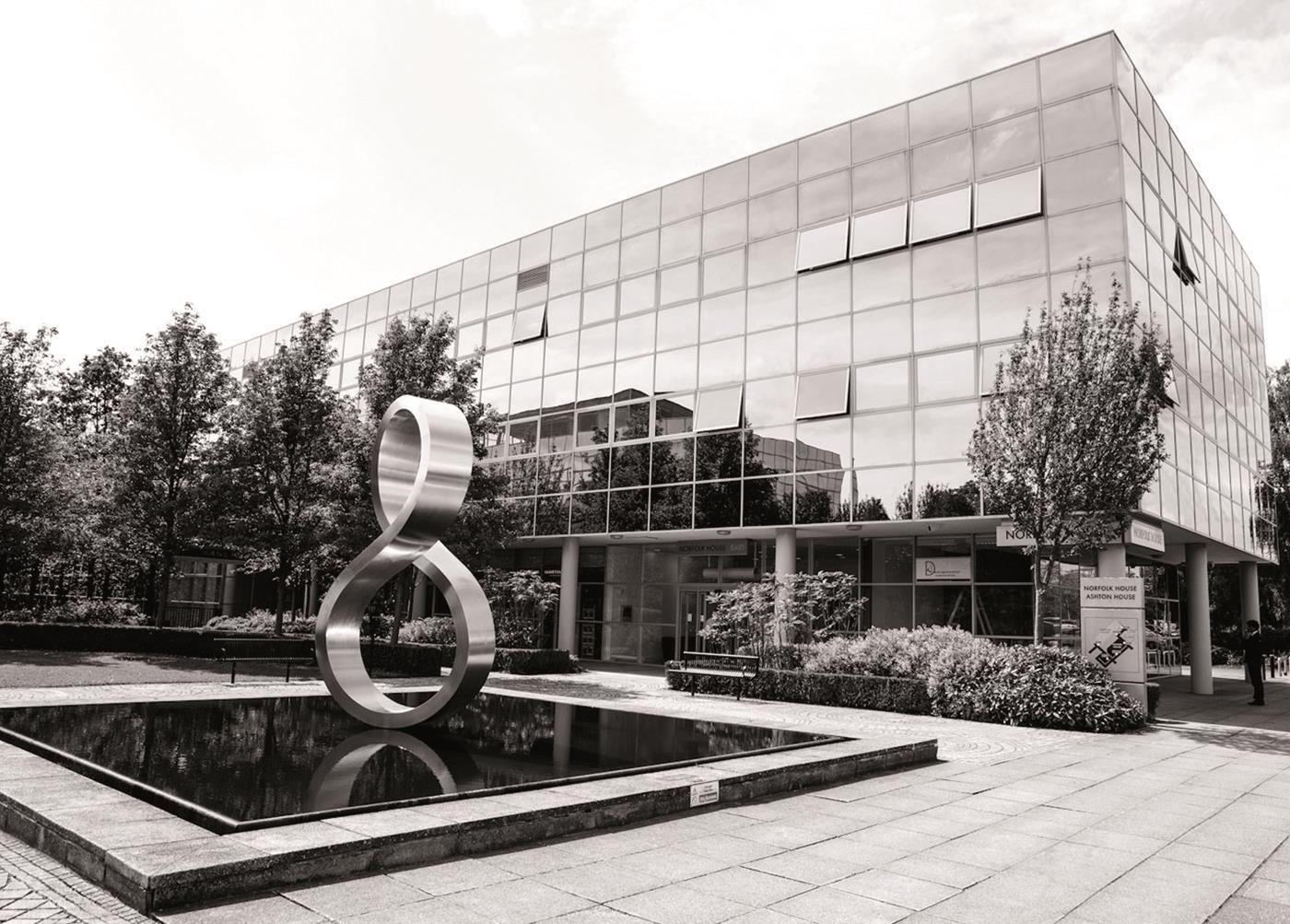
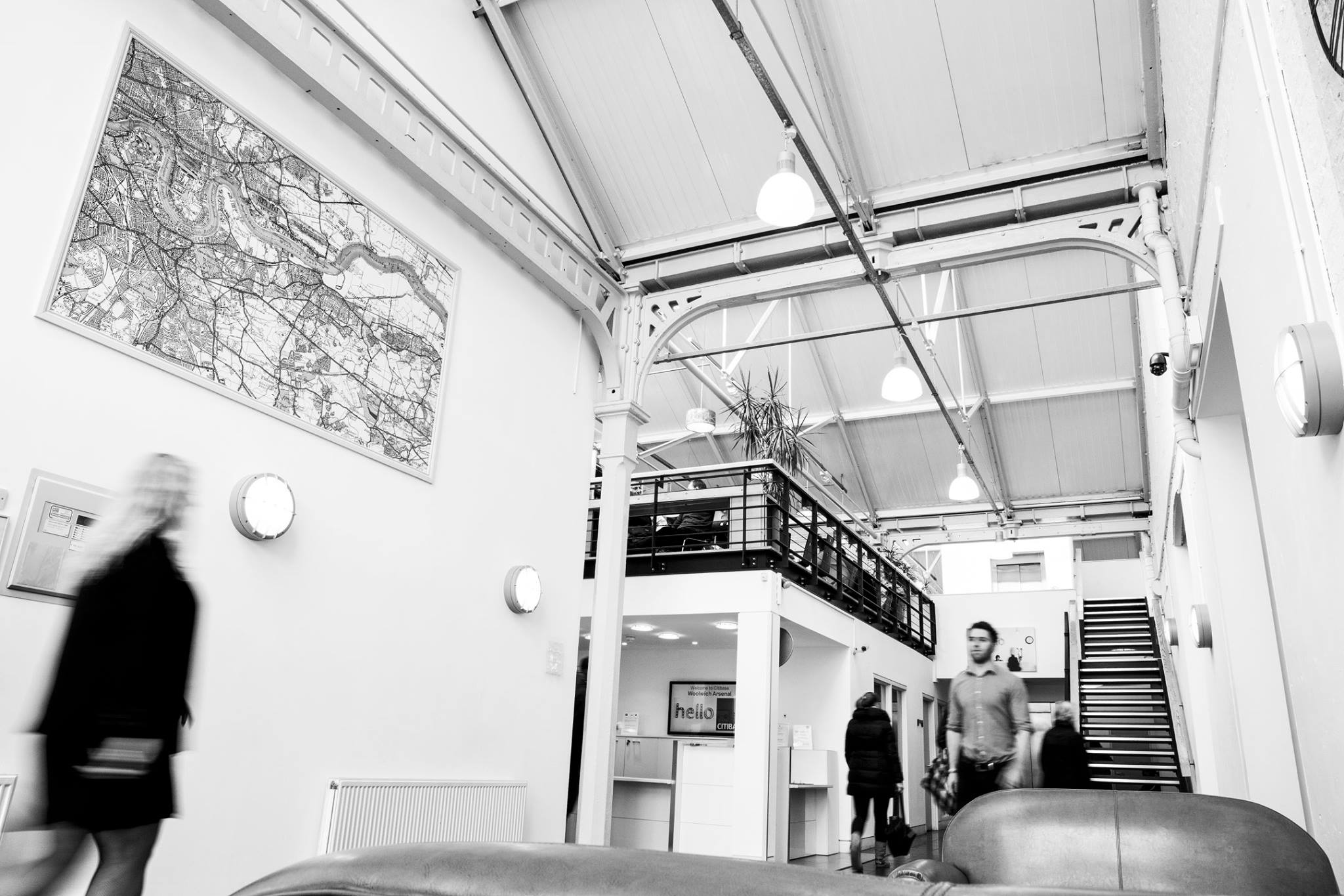
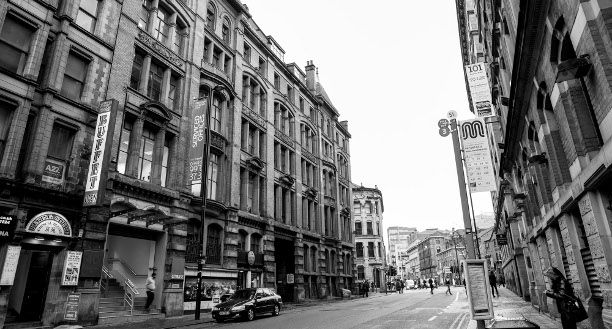
Citibase provide affordable office space for start-ups and SME’s across over 40 cities in the UK. I joined at a time that the market was getting more and more competitive and there was a need for an identity review.
Having done some in-depth competitor analysis and user buying behaviour we identified all the competitors were presenting their space in similar ways - showing the space, facilities and differentiating through square footage.
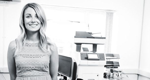


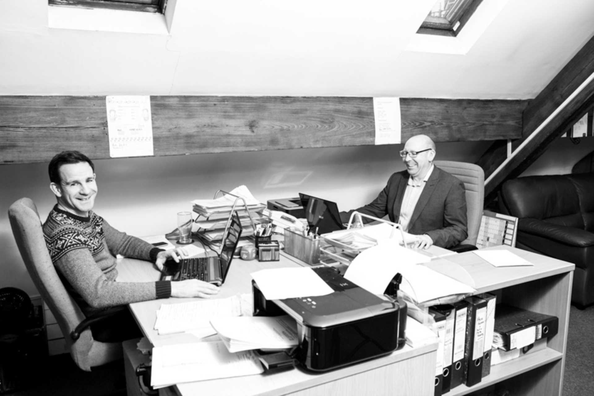
We identified two opportunities for difference. One, was to have an immediately identifying colour that stands out on the pages and pages of digital listings these properties appear in. Two, present the dreams and human aspects of what is happening in these offices and inspire others to follow similar roots.
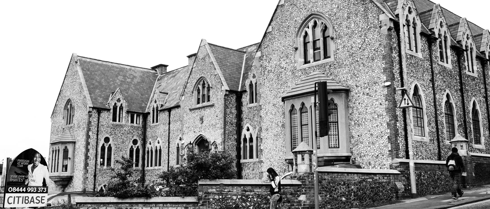
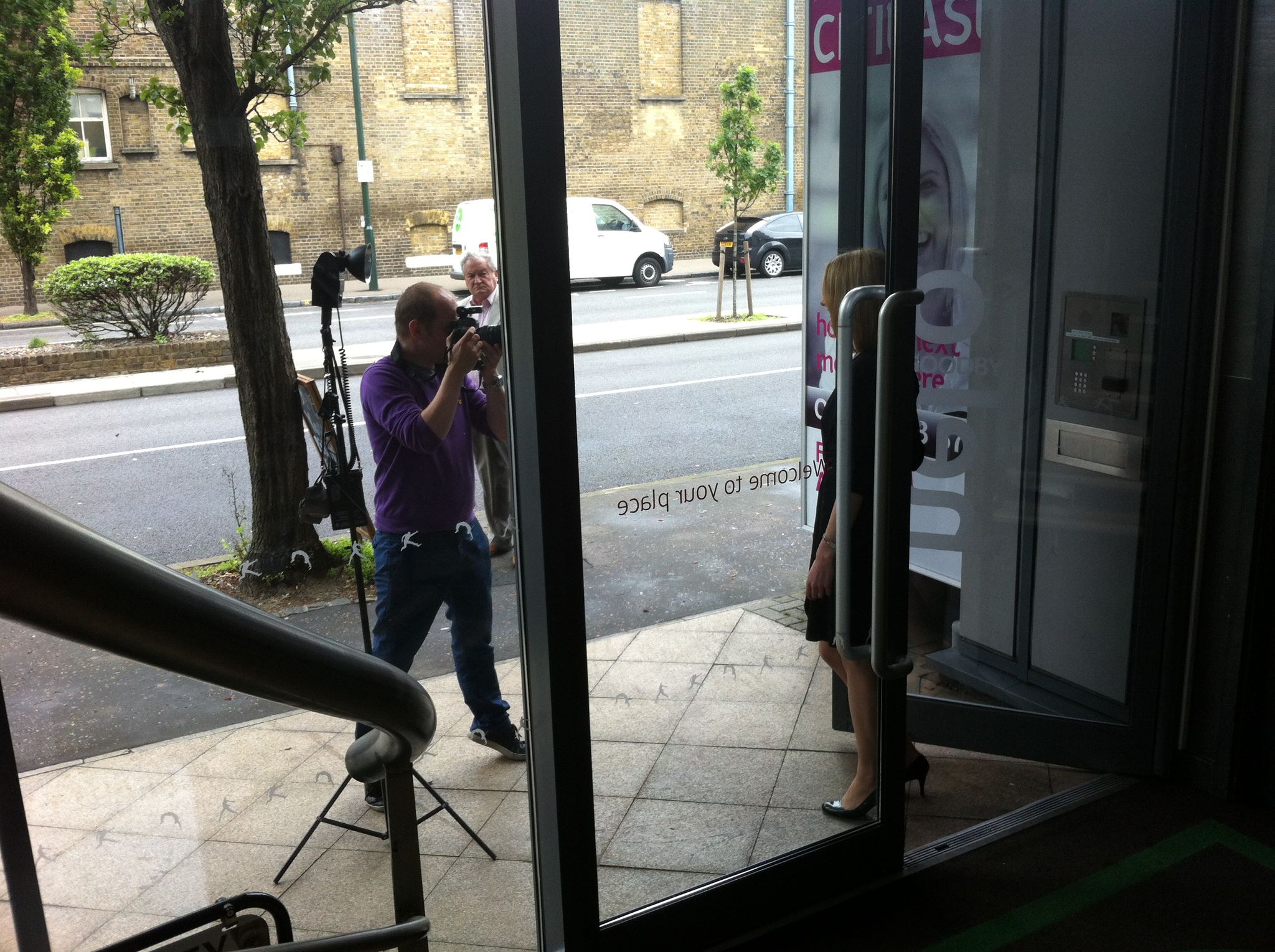
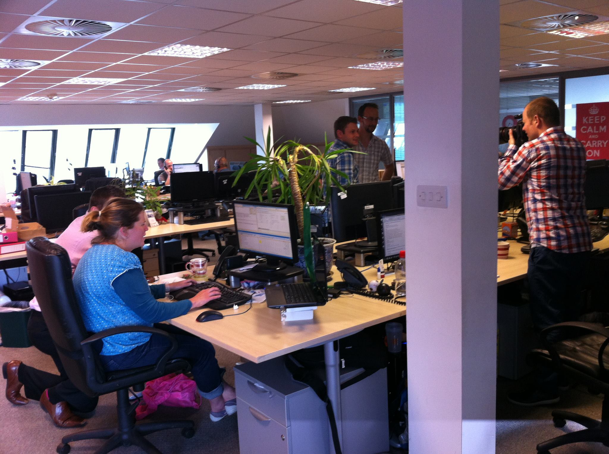
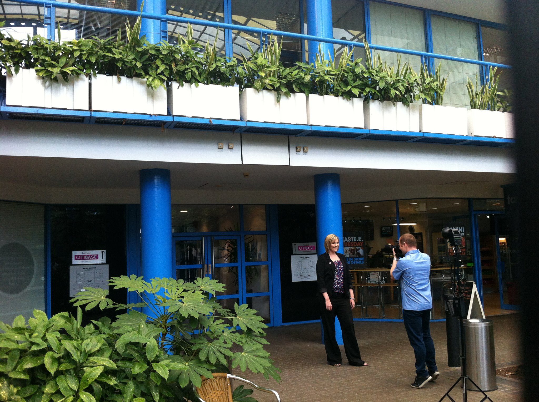
We traveled to every location and re-shot a suite of assets per location and then converted to black and white with a hint of the company pink, which in itself tells a story but also added drama.
We recorded people’s stories and captured them in their space, bringing the offices to life.
This translated to the company website (www.citibase.com), brochures, editorials, in-office branding and social media.